Tuesday, 5 May 2009

Evaluation - Morgan


Evaluation

Informal Evaluation

From my own view point I think the project did create a fearful atmosphere for the audience, with our knowledge and research of horror films we were able to use the idea’s in an effective way. For example, the use of a clown as the stereotypical villain, and the use of camera shots, such as the canted angle we used which showed the characters as being confused or disorientated at that time in the sequence. I feel we created a sense of fear and created enigmas with the use of lighting, flashbacks, camera angles and diegetic and non-diegetic sound. However to have created a more effective sequence I feel we could have used shorter shots and told different parts of the film rather than just the one narrative throughout which would have developed more enigmas and made the viewer more enticed to watch the whole film.

Evaluation

For the AS Media coursework, my partner Jack and I were required to create an opening sequence of a film. We decided to create the opening to a horror film. We both researched and analysed opening sequences to horror films and researched other elements to develop a story for our horror film. We brought our research and findings together to begin to assemble our project.
I analysed an opening sequence to a popular horror film,

Conventions of our media project
As we both had most knowledge of teen preferences of films, and knew what would appeal to teens we favoured a horror opening sequence as we were more educated in this area having watched many ourselves. Between us we could use the information we knew and try to produce a similar product which would invoke fear in the audience. We decided to use as many key conventions of horror films, for example, the vulnerable screaming. We also used conventional camera angles, such as canted angles, high and low angle shots, over the shoulder and point of the view shots as it gives a sense of the victim being followed.
We thoroughly thought out the camera angles and both agree we have used them effectively to raise fear into the audiences minds, which has been commented on by the audience in a positive way.

Social Groups
We have presented two social groups in our sequence from the horror film world, the victim and the villain or otherwise known as the antagonist.
The Antagonist
In horror films there is usually only two different types of antagonists; they can be presented as human, where they can be seen as normal yet in general are mentally twisted and have had some sort of terrible past that makes them progress into villains or just simply insane such as in Saw or Scream. However sometimes are seen as being perfectly normal yet as the film commences we see their breakdown progress as the film does, as seen in The Shining and Psycho.
The second type is seen in psychological horrors, where the circumstances of the story are seen as being unrealistic yet portrayed in a realistic way it is then believable for the audience. This can be seen in such films as; Silent and Jacob’s Ladder.
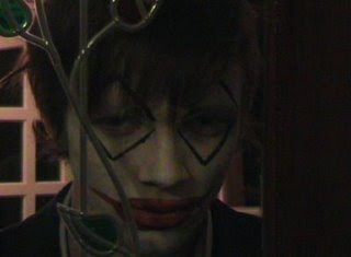
We decided we would represent our antagonist as a Clown, yet at first he is seen to be more human at the beginning of the sequence, although he appears to come from nowhere. This is used in other horror films to easily scare the audience. Our antagonist presents some conventions of serial killers, his disturbing look (which is based on the Joker’s look from Batman) which is purposely juxtaposed with the suit he is wearing, which is to represent his twisted mind, his refined look yet psychotic mind, portrayed by his facial makeup. Other conventions presented are his capability of disappearing quickly and his silent nature. The purpose of introducing the Clown in the opening sequence was to set up enigmas, so the audience would question who he was and why he is at the house and also, most importantly what he is going to do.
The Victim
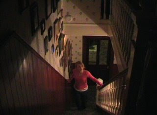
Often the victims used in horror film opening sequences are teenage girls, who are seen as being young, innocent and defenceless. To portray this in our character, I dressed in pink approach to unusual happenings is for the characters to go looking themselves rather than leaving or getting help, they go alone into the danger, this behaviour is popular in horror/slasher films such as Scream and Halloween. The narrative is set in a usual situation, the victim is in a typical house, typical clothing, nothing not the norm about her, as the Clown watches and seems to stalk the young girl the audience, after seeing her innocence begin to feel sympathetic for her.

Distribution
For the film we have created Lionsgate Entertainment are a popular entertainment company who have produced many successful and award-winning films would be an ideal company to produce our film. The company have often taken risks in releasing films that are different to the type of film favoured by film viewers; therefore we think they would take a risk in distributing our film. They are responsible for the release of the four Saw films and most recently The Haunting in Connecticut.

Audience
Our opening sequence is aimed at teenagers and obviously may appeal to any horror film fanatics. This genre of film is aimed at both male and female yet it is alleged that horror films are mainly targeted at males. Both genders are focused on when producing the film with neither in main aim of attraction. Teenagers are an ideal target audience as they often attend cinema’s and are more likely to buy films then the older generation.

Key features of an opening sequence
To portray the correct messages to the audience we had to include several things to create a successful opening sequence.
We decided to present a short but obvious equilibrium at the very beginning of the sequence to easily disrupt the atmosphere. We see the babysitter putting the child to bed yet also have a sense of out of the ordinary in the air. This is where we begin to introduce enigmas and the narrative is disrupted. When the audience become aware of things going wrong we decided to then introduce the Clown. This is where more enigmas are addressed and the audience begin to question why he is there and why he is targeting the young babysitter. These enigmas entice the audience and keep them engrossed in the narrative.
A convention in the setting of horror films is a large old looking house set at night, which we included a shot of at the beginning of the sequence. The costume and house decor convey the time the sequence is set, the house has a typical modern day look and all the general things that would be recognised by the audience.
Another common ideology used in horror films is the binary opposition in good and evil, presented through the characters; the babysitter being good and the Clown being evil. We communicated this by the set up of an obviously intended attack (yet still unknown by the audience) from the clown to the young girl. This is present in other films such as Halloween with Jason and the babysitter (Jamie Lee-Curtis).
Music is more commonly than not used to build dramatic tension, we adjusted the volume level to be louder at more dramatic building times yet quieter at times where dialogue was spoken as this helped to develop the narrative.

We used several shots and angles in our cinematography, this helped increase tension and fear. We used a canted angle when the babysitter walked into the bed room; this was to present to the audience the characters confusion of the goings on at that moment in time. Our project followed one character in particular so we were able to successfully achieve continuity editing throughout.


Technology
Whilst creating the sequence we were able to develop our skills of using a camera. Through the process of creating our sequence we under went a preliminary task, this gave us the opportunity to make mistakes we could then learn from to perfect our opening sequence. We also used the internet for research on other horror films and for ideas for our own film. We also created a blog where we placed clips and research, which we could both access if unable to reach each other, which was a great aid in developing the project.
Morgan Anderson

Sunday, 3 May 2009

Evaluation; Jack Tomlinson

Evaluation
1.Informal Evaluation
Personally, I think our media project does invoke fear into an audience, through the use of simple and effective terms, such as using a typical public fear and utilising it as a character that will scare viewers that just look at it; the clown. I like the canted angle we used as it creates a sense of confusion and disorientation for the character as well as the viewer, timed well with the enigmas for a whole sense of turmoil. However I feel that for a more effective opening horror sequence, we should have used more of a collage of shots rather than a short narrative story, as they are more to the point, create more enigmas and easier to follow.

2.Audience Testing

Myself and Morgan devised questions and asked two people, a male and a female, from the demographic of our film to see how they responded to the film.
1.Did you feel a sense of fear from the opening sequence?
-'yes I got shivers!'
-'yes'
2.What did you think of the Clown?

-'scary and realistic'
-'he was very scary'

3.What did you think of the babysitter?

-'very believable'
-'she was nice'

4. What did you think of the title?

-'very simple, tells you what the story will be about'

-'straight to the point and effective'

5. Would you want to continue to view the film?

-'yes I was intrigued'

-'yes, definitely'

6. Would you pay to watch it?
-'yes'

-'yes I would'

7. Do you follow the storyline?

-'yes really easy to follow'

-'yes I follow it'

8. Does the film remind you of any other film?
-'no'
-'it reminds me of IT


9. Are there any scenes that stand out? If yes, why?

-'when the babysitter sees the clown through the window, because the filming is very good when it gets closer quickly, it scares you'

-'when the woman realises about the clown, it is scary

10.Does the sequence appeal to you?

-'yes I want to watch the rest of the film
-yes greatly'

11. What could be improved?

-'could use a better camera, maybe the writing could be better'

-'camera work, I felt that the cameraman was somewhat inexperienced and clumsy'


Overall the comments are quite positive, the Clown character was quite well received and the overall impact of the film on our test audience was positive. However both commented on the camera work, which could most definitely be improved on.

3.Evaluation
For our AS Media Studies coursework, myself and my partner Morgan were required to develop an opening sequence of a film. We chose to develop the opening of a horror film. We both analysed other horror films and conducted research about horror films and other various materials to eventually be able to construct our project. I analysed the mise-en-scene of our film, other horror film antagonists, locations, the horror demographic and changes in horror films over recent years, and the opening sequence of a popular horror film.


*Conventions of our media project
We decided to make an opening sequence of a horror film, as it is a popular genre of film to teenagers, and as having viewed many horror films between us we could use our knowledge to try and create a similar product, which induces fear into an audience. We tried to include several key conventions of horror films, such as the typical naïve victim, demented killer, screaming, darkness, confusion. Other conventional elements include camera angles which we tried to use to convey a sense of fear and confusion such as a canted angle, axial shot, and high and low angle shots.
We think we used sufficient and effective conventions to elicit fear, as recognised by the results from our test audience, particularly when the axial shot is referred too.


*Social groups
There are two social groups of the horror world that are shown in our sequence, the victim and the primary antagonist.
The victim; Victims shown in the beginning of horror films are generally teenage girls, portrayed as innocent and naïve, we tried to do this by dressing Morgan in pink, which is seen as girl-y and fun, without a care in the world. Typical behaviour can be found when trying to confront the horror she finds in the house rather than going to get help, popularised in many typical slasher flicks (Scream, I Know What You Did Last Summer). Our victim is set in a typical house, in typical clothes in a typical situation, there is nothing seemingly unusual about her, the innocence incites viewers to feel sympathy for her as she is watched and stalked by the clown.

The antagonist
There is a great divide in horror films as to where the antagonist can be found, they are either human; where they appear to be normal, but generally in twists or if they are made obvious to be the killer, they are often insane of just plain evil (Saw, Scream). Sometimes however, in order to often provoke MORE fear into an audience through the use of antagonists, they will become or are acted out in plausible situation, (The Shining, Psycho).
The second type is through psychological horror, where the situations are greatly unrealistic yet due to the verisimilitude they are believable. Films often deal with psychological horrors like this, (Jacob's Ladder, Silent Hill).
Our antagonist, the Clown character, is shown to be more human than psychological in the opening sequence. Whilst appearing to come out of no where for example, this is done in many horror films, such as Scream for easy frights.
Our antagonist carries a few conventions of serial killers about him, he has a deranged look (which was based on the look of the Joker from Batman) which is juxtaposed with the elegant suit he is wearing, this was to show the calculated mind of the killer, he is sophisticated, yet psychotic, shown by the face make up.Other conventions include his muteness and ability to disappear with ease.
The main function of placing the Clown in the opening sequence is to set some of the films major enigmas, such as “who is the clown?, what does he want?” etc

*Distribution
A popular entertainment company which has produced many popular and successful horror films is Lionsgate Entertainment, which would be suitable for producing the film we had created. Its first major box office success was American Psycho in 2000, which began a trend of producing and distributing films far too controversial for the major American studios, this shows that while the productions will produce horror films, they often need to have new characteristics to differentiate itself from other movies. Other popular horror films include the Saw series, Ju-On The Grudge, Hostel, Alone In The Dark and The Devil's Rejects.


*Audience
Our horror film is very simplistic, and is aimed at a teenage audience, and obviously to any horror film fanatic. Horror films are perceived to be favoured by males, yet is aimed for both sexes, with the content neither focused on males nor females in any traditional way (e.g. such as casting a mainly male cast for a female audience and a mainly female cast for a male audience). Targeting teens is a good way of earning money, as many teenagers visit the cinema as a past time, it also varies out from the loyal niche audience of horror film fans. Results from our target audience also shows that teenagers would enjoy the film.

*Key features of an opening sequence
In order to fulfil the creation of our opening sequence, there are many things it had to include to convey messages to the audience.
The equilibrium is very short but in this way, we can quickly establish a sense of the normality being disrupted. We see the babysitter putting the child to bed, and soon after the strange things begin to happen, this is when the equilibrium is broken and the audience is aware that things are going wrong in the narrative. During the disruption, we are introduced to the Clown, setting up the first of many enigmas as previously explained. Other enigmas include why he is targeting the young innocent girl? What happened to the girl? Why does the killer have his face painted? These enigmas incite the viewer to keep watching, by keeping them interested in the narrative.
The chronology is established by the shot from outside of the house, a modern setting at night time, a convention of horror films. The house and clothes also help establish the time, as everything is modern and we see everything we would see in general life. The location is also established within the opening sequence. It is set in a quiet area, of a normal English town. The whole town is not established within the opening scene, however this is not always necessary at this point.There is an element in binary opposition in the opening sequences, as portrayed by the characters, as good vs evil, with the babysitter as good and the Clown as evil respectively. This is set up with the (as of yet) unapparent attack of the young girl by the Clown, it starts the fight between good and evil, a common motif or ideology of every horror film, for example Saw, the police trying to capture Jigsaw the serial killer, Hostel, the protagonists trying to escape from the torturers etc. This helps establish the narrative.
Tension is often built using music, we used a track that maintained a tense haunting sound yet adjusted the volume levels, for example getting louder at more dramatic moments, in order to help raise the level of tension.
In our cinematography we tried to use angles and shots in order to help further increase fear and tension. Several shots in particular, such as the axial shots used when going closer to the Clowns face. This shot is used in such films such as Saw in rapid succession, to induce confusion and also fear, which was the objective in the instance.


Another shot was the canted angle of the babysitter walking into the bedroom, this shot was used to show her disorientation and confusion to the whole situation. We managed to get seamless continuity editing with our project, as we were following only one character specifically. The viewer follows here and does not get confused with where they are viewing from, following the 180 degree rule.


*Camera Shots
The shot of the babysitter ascending the stairs was a high camera angle, looking down on her, to make her seem small and fragile, like victims are often shown. Her coming from the light area into the dark signals she is leaving the safe zone and entering into the unknown.


The over the shoulder shot of the babysitter looking at the TV makes the viewer feel more involved in the narrative, as if you are in the place of the babysitter.


The various close up shots of Morgan express a lot of the emotion found in the clip, with very little speech in most horror scenes like this, it is often left to facial expressions to inform the viewer about emotion, the close ups are generally used after an encounter with the clown and show her fear and confusion.


Shot-reverse-shots are used when the babysitter speaks with the little girl, this makes the convosation seem flawless and abides to the 180 degree rule so the viewer dosen't get confused with where the characters are.


*Lighting

The general lighting is very low key, a key convention in any horror genre. The low key lighting makes the whole mise en scene seem eerie and mysterious. Connotations of the dark include monsters killers, fear, evil etc. One of the shots show the babysitter approaching the static TV, this shot is reminiscent of 'The Ring' and the light from the TV casts a cunning glow over the babysitter.

*Technology
We learned a lot about how to use a camera whilst producing this sequence. During the creation of our preliminary task, we made many mistakes with the camera, especially in the positioning of the camera, however whilst making the opening sequence we looked carefully at how we positioned the camera, and with lots of practice with the tripod we managed to get much better shots.
The online blog was very useful with managing what we were doing with our time and what we wanted to do. It was helpful to be able to put clips on the blog in order to emphasis several points made.
Skills of searching the internet were also enhanced, as I searched for a lot of background information on opening sequences and horror films, to find the most useful and accurate information.


;Jack Tomlinson

Thursday, 30 April 2009

Wednesday, 4 March 2009

P.S.

I need to see evidence of audience testing here. Show your film to members of your target audience to get their response. This will help you to evaluate the effectiveness of the production more objectively.
Mrs A

Feedback 3.3.09

Hi guys,

You need to post your completed sequence on here now please. See Rachel or Nikki regarding this if you're struggling. Also, if you haven't already, make sure your bring in a disk (+R DVD) for us to burn your project for the examiner.

Thanks (Mrs A)

Tuesday, 20 January 2009

Filming Edits On Storyboard

Upon some test shots, we came across some problems within filming our shots specified on our storyboard.
Shot 6; because of the size of the room, the camera will be more focused on Morgan as she enters the room and sits down rather than showing the whole room. Since the TV is important in a later shot, it will be established as being in the room by Morgan switching it on and by the diegetic noise it produces.
Shot 7; Rather than the killer appearing at the window, as he would be difficult to see, he will instead stand in view on the other side of the living room door. Also, this helps establish a first person view shot later in the scene, as we can see now that he is already in the house.
Shot 12/13; Once Morgan reaches the top of the stairs and goes into the little girls bedroom, the camera will follow her from a first person shot, designed to make the viewer think she is being followed. We also found that this will be done while holding the camera in hand, and the creaks from the tripod were distracting plus the shaky movement looks like some one is watching her. 

;Jack Tomlinson&Morgan Anderson